
The Role of Color in Minimalist Furniture Design
Chosen theme: The Role of Color in Minimalist Furniture Design. Explore how restrained palettes, thoughtful accents, and light-savvy materials shape serene, characterful spaces. Stay with us for stories, practical frameworks, and creative prompts—and share your own color journeys or subscribe for new palette guides and minimalist moodboard challenges.
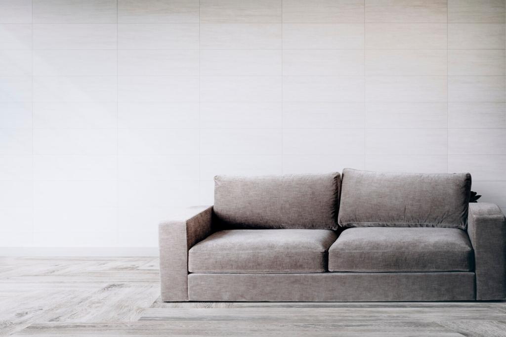
Why Color Matters More Than You Think in Minimalism
Calm Neutrals as Emotional Infrastructure
Minimalism thrives on intention. Soft whites, bone, mushroom gray, and warm beige steady the eye, reduce visual noise, and stage furniture as quiet protagonists. Neutrals are not boring backdrops; they are emotional anchors that temper stress and invite stillness without suppressing character or comfort.
Contrast Without Clutter
A single deep accent—ink black steel legs or a charcoal felt chair—creates a crisp edge that organizes space. Instead of many small contrasts, choose one deliberate moment. The result is clarity: your eye rests on the hero form, while the surrounding palette reads as confident, composed, and breathable.
Undertones: The Invisible Hand
Two whites can fight each other if undertones disagree. Blue-leaning whites can chill oak, while creamy whites flatter walnut’s warmth. Reading undertones ensures furniture and walls harmonize, preventing that uncanny mismatch that looks accidental rather than artfully minimal.
Choose a Devoted Base
Pick one foundational family—warm neutral, cool gray, or soft greige—and use it consistently across large surfaces and primary furniture. Consistency creates rhythm. When the base repeats, your eye recognizes order, making even modest rooms feel composed, intentional, and unmistakably minimal.
One Accent, One Story
Select a single accent color and let it appear two or three times with purpose: a chair, a lamp, a throw. When repetition is gentle and deliberate, the accent feels like an authored chapter rather than random decoration. Minimalism loves restraint, and repetition reads as confidence.
Material Dialogues: Wood, Metal, Textile, and the Hue Between
Wood Tones as Warm Neutrals
Oak, ash, and maple read airy and contemporary; walnut and teak lend depth and maturity. Pair warm woods with cream or greige to avoid a chilly mismatch. Let one wood dominate to prevent a patchwork feel and to keep the narrative consistent across the room.
Metal Finishes as Lines of Emphasis
Blackened steel introduces structure; brushed brass adds a measured glow. Use metals as subtle punctuation: legs, pulls, frames. Limit finishes to one or two so the room retains calm geometry rather than turning into a catalogue of shiny distractions.
Textiles: Matte, Sheen, and Shadows
Matte cotton and wool quiet reflections, while linen introduces breathable texture. Avoid heavy gloss on large surfaces; instead, invite gentle light play. A single velvet accent in a restrained color adds depth without noise, letting minimalism feel soft, not sterile.
Light and Color: Designing With the Sun and the Bulb
North, South, and the Color Drift
Northern light cools hues, emphasizing blues and grays. Southern light warms everything, flattering beige and wood. Test swatches on multiple walls and observe morning to dusk; minimalism relies on accuracy because there are fewer elements to hide mistakes.
Bulb Temperature as a Palette Tool
2700K bulbs feel intimate and warm; 3000K reads clean and modern; 4000K risks sterility in homes. Match bulb temperature to your base palette so textiles and wood tones remain true. Consistent bulbs across rooms protect your minimalist narrative from unintentional shifts.
Finish and Reflectance
Eggshell and matte walls reduce glare, letting furniture color stay honest. High-gloss can bounce color onto nearby surfaces, complicating harmony. Choose finishes with intention so light frames shapes rather than distorting them, preserving the quiet clarity minimalism depends on.
Small Spaces, Strong Statements: Color Moves for Compact Minimalism
Keep walls and large furniture within a narrow tonal range to create uninterrupted sightlines. This visual flow dissolves boundaries, making tight rooms feel expansive. Introduce subtle depth through texture rather than extra hues, preserving calm while avoiding monotony.
Stories From the Studio: One Hue, Real Transformations
The Deep Green Chair That Calmed a Studio
A reader swapped a busy gallery wall for a single forest-green lounge chair. Against oat walls and oak floors, the chair became the room’s heartbeat. Plants echoed the hue, and suddenly the tiny studio felt intentional, not sparse. She wrote back: “I’ve started breathing slower at home.”
A Powder-Blue Rug That Softened a Family Room
Harsh grays made evenings feel cold. We introduced a low-pile powder-blue rug beneath a light greige sofa, repeating the hue in a ceramic lamp. Nothing else changed, yet the space turned welcoming. The kids began reading on the floor again—color altered behavior, not only aesthetics.
Terracotta That Warmed a Workday
A home office felt clinical. A terracotta sideboard under a matte white wall brought grounded warmth, echoed by a clay pot and a single book spine. The owner reported fewer afternoon slumps and a surprising sense of rooted focus—one hue reframed hours, not just objects.
Practical Toolkit: Test, Tune, and Care for Your Palette
Collect fabric swatches, paint chips, and finish samples. Observe them beside your actual furniture for a week. Note how morning and evening light change perception. The diary becomes a reference library that prevents impulsive, mismatched purchases.